User experience and design thinking is all the rage these days. Yet, I am aghast at how often the design of toilets (aka bathrooms or loos) is regularly overlooked. Sure, there may be stylish or trendy wash basins; but they all too often forget the practical aspects. For example, they are hard to clean; or the hand dryer is in an obscure location; or there is no place to put down a wallet or phone, etc. I shall never forget the case of the urinal designed in the house of dear friend’s father, whose architect was under five foot tall. He wanted to add a nice window through which to look out while taking a natural pause. The architect saw fit to add a window that was eye level… for him. The net result was that the very same window would give a view for those outside of the lower midriff of a man of normal height! Piss-poor design, we could call that.
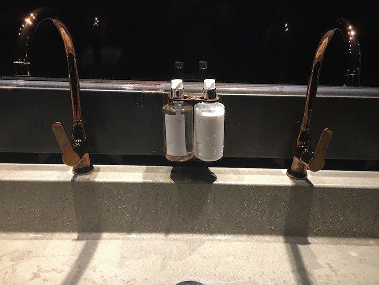
Where you can tell that user experience has been disregarded is often in the soap and hand cream offer. Typically, providing a hand cream (especially in a men’s toilet) would be considered a sign of distinction and/or luxury (at least an added value). Below are a few examples of how these are proposed:
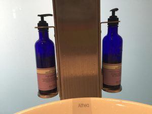
How often would a man blithely take a squirt from the wrong one?
What do you notice?
User Experience – Visual codes
The team that approved the installation of a hand wash and hand cream dispenser presumably argued that this was a nice “added touch.” Except, for men, the “code” of a hand cream is not so obvious. For starters, the vast majority of men do not use or worry about hand creams. Even I, who worked at L’Oreal, do not really concern myself with the softness of my hands. As a result, many men would likely make the same mistake I made of just pumping the one closest to you…. and being disappointed when the white liquid didn’t mousse. [MEN: have you ever done that?] Even if the “visual code” may be obvious in this post (that white = cream and clear = soap), I would argue that it’s not a natural distinction men make. And, even if they did, I bet that the number of times they make the mistake is greater than the number of times they purposefully add cream to their hands. I.e. A net value subtraction.
UX – Readability
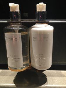
Given their low position, you have to bend over to read what is written on these bottles. I took a photo at product-level in order to be able to read what is written. Here the fault lies with the manufacturer (The White Company) of the soap and cream. The silver typeface is chic and elegant and… harder to read (even close up).
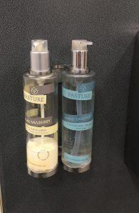
But they are not alone… Pasture Naturals calls soap by another name: hand sanitizer.
 And the prize goes to…. Neal’s Yard, where the bottle masks the content. One is called Citrus Hand Wash and the other Citrus Hand Lotion. You need to be especially attentive here.
Would that the cream were always on the right, for example, but such is not the case.
If these mistakes or oversights are being made, it is because the designer — and the overseeing manager — has not taken the time to go through the user’s actual experience or have the empathy to understand the user. Design thinking means being in the user’s shoes, understanding his/her context. If these cases above are minor, they still help to point out that user experience and design thinking have a long way to go to get good, much less great.
P.S. We could probably have a field day examining wash basins created by the creative designer who never has to wash the basin itself!
Please add in your thoughts and/or other similar experiences and examples.