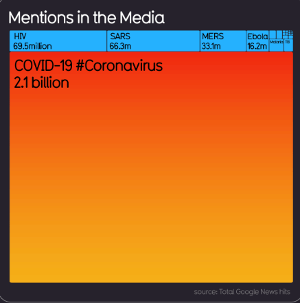
In Hans Rosling’s brilliant book, “Factfulness,” that was published in 2018, he identified the three fear factors that drive us to systematically overestimate the risks: violence, captivity and contamination. He goes into great detail to look at the difference between what’s frightening and what’s dangerous. During this Coronavirus/Covid-19 lockdown, I am paying attention to our reaction to this crisis using a factfulness-inspired filter. In particular, I have been struck by the abundant media coverage. In mid-March, the site, Information Is Beautiful, published an astonishing infographic about the amount of media coverage for the last several pandemics.
In an exchange with the makers of this infographic, I learned that their data set is open access (Google Doc) and available to all. I must point out that the number of results on Google News varies dramatically day by day, and, I would say, rather disarmingly so. But the general gist is there and surely, I can be happy that I only have to wait for a 1/2 second for Google to count the total number of hits.
Introducing some perspective
In any event, as Hans Rosling likes to do in order to read data, it’s best to compare. In the case of this infographic above, they compared the media coverage of Covid-19 to past pandemics. The result speaks for itself. Yet, I think that there’s a couple more comparisons that are worth doing, inspired by Rosling’s approach.
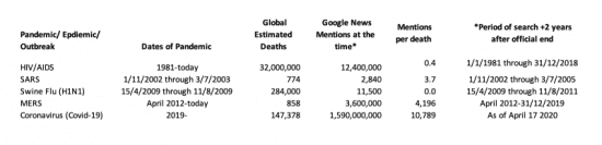
In Factfulness, that was written in collaboration with his son and daughter-in-law, he wrote about the last pandemic, the “swine flu” or H1N1 that occurred between January 2009 and August 2010, that he “got tired of the hysteria and calculated the rate of news reports versus fatalities. Over a period of two weeks, 31 people had died from swine flu, and a news search on Google brought up 253,442 articles about it. That was 8,176 articles per death.” That’s an extraordinary number of articles penned and references made in news sources and blogs around the world for every soul who died. Just think of the hours spent by the reporters of each article. As we know, however, there were many more deaths from the swine flu. In an article published in 2012, the CDC estimated that the total number of deaths worldwide was between 151,700 and 575,40. These estimates “are more than 15 times higher than the number of laboratory-confirmed deaths reported to the World Health Organization (WHO).”
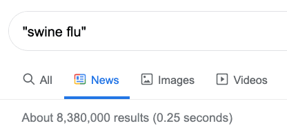
Taking a more complete and updated view, according to the Google News search today, there have been a total of 8.4 million articles on swine flu. With the CDC number (284K) of deaths, that equates to 30 articles per death. It’s worth signalling that the number of news hits today has of course jumped for all past pandemics because of the comparisons in news report on the Coronavirus.
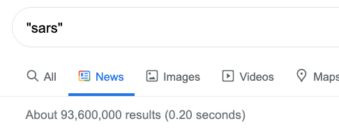
Bearing in mind that, in the infographic above, the number of mentions in the media reflects the tally that Google gives in a split second to a search request, it’s worth putting those numbers into perspective. Take SARS, which during the period of infection (Nov 2002 to July 2003), according to the NHS, resulted in 8,098 reported cases and 774 deaths globally. With 93.6MM hits as reported today, that means that for SARS, we have had 120,930 mentions per death. (It would have been just 85K/death back in mid-March).
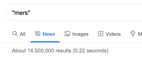
For MERS, the statistics look quite out of proportion, too. According to WHO, there were 858 deaths worldwide. With the updated Google News hits, that means we’re at 16,900 mentions per death.
HIV/AIDS an outlier?
For HIV, the numbers speak to a different situation entirely. According to UNAIDS, from the beginning of the HIV epidemic in 1981 through the end of 2018, an estimated 32 million [in a range of 23.6MM–43.8MM] people have died from AIDS-related illnesses since the start of the epidemic. Taking the 69.5 million articles in Google News, that means there have been roughly 2 articles per death (using the 32MM number of deaths).
The facts about Coronavirus
So, with Coronavirus deaths on the rise every day and the media outlets continuing to besiege us with news, where does that leave us today? According to Worldometer, we’re at 147,378 deaths globally due to Coronavirus.
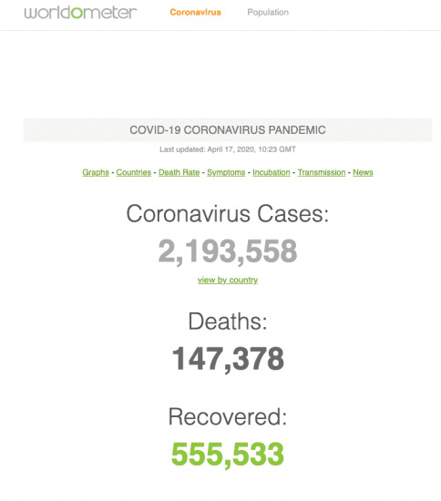
That means that, according to the very latest Google News results (down from the 2.1B reported by Information is Beautiful) with 1.6B hits, we’re at 10,789 mentions per death. In the spreadsheet below, I’ve normalised the Google News hits to the time we’re living through the crisis. And, if we look at the column “Mentions per death” and limit the time span in Google News for the time of the outbreak plus two years after the official end (when such has been determined), it looks like there’s a palpable and dramatic trend upward.
As Rosling points out, there is a great deal of difference between what’s frightening (fear) and what’s dangerous (i.e. fatal). In this period of lockdown that so many of us are facing, we are feeling some form of captivity, meaning that unlike other pandemics, we’ve combining two (captivity and contamination) of the three frightening fears. And for some terribly unfortunate people, as has also been reported, there’s the addition of violence at home, too. I’m certainly not wishing to downplay the horrors that some people have experienced, nor the enormous effort and bravery of those on the frontline in over-run hospitals. Yet, I believe Rosling’s instruction is to use facts to put things into perspective. A final figure that also serves to put the number of deaths from Coronavirus into perspective is to look at the annual flu figures. Annual deaths from the seasonal flu, according to the WHO, are between 290,000 and 650,000 people per year.
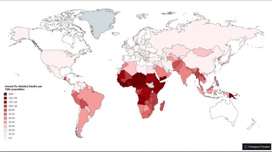
I feel that these two contrasting maps below serve to explain why there is a higher degree of obsession in the media with Coronavirus versus the seasonal flu. First, here is the heat map that shows the number of flu-related deaths per 100K population in 2019.
The next map is from the European Centre for Disease Prevention and Control (ECDC) (published April 17 2020) and shows the deaths per million of the Coronavirus around the world.
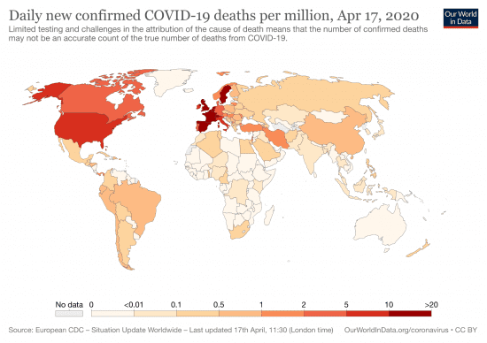
Indubitably, these two pictures together tell a tale about why we are much more concerned with Coronavirus. The media is clearly paying more attention to the hardships in the First World than those in more distant developing lands. I am laying out no judgments with these two maps. I believe they just help us to understand why there’s so much more hype and media coverage today.
While every death is heart-rending for those involved, we can see that we’re still far from an average flu season in terms of fatalities. With the rate of mortality for Coronavirus so (luckily) low, I believe that we should take stock of how we are feeding off the media and try to stem our overriding fears. Because the trauma and social scar tissues post-Covid-19/Coronavirus risk being far more damaging. I feel that the numbers presage an increasing trend of hysteria and obsessiveness about frightening elements that can’t be healthy. I dread the idea of a second wave.
If you’re running a business, you’ll know how difficult this period is from a financial perspective and presumably are quite worried about what the near-term future holds. Putting out Coronavirus-related communications, as some companies have seen fit to do, that are platitudinous or wishy-washy will not only get lost in the sea of media, they will likely just serve to reinforce their perceived lack of genuine leadership, courage and determination. In the face of overwhelming fear, fanned by mediatic flames, we owe it to Hans Rosling to take a look at the facts with a degree of calm. I personally feel it’s a great time to remind ourselves of what’s important in life.
*Rosling, Hans, Ola Rosling, and Anna Rosling Rönnlund. 2018. Factfulness: Ten Reasons We’re Wrong about the World and Why Things Are Better than You Think. London: Sceptre.
***If you like my writing and are interested in fostering more meaningful conversations in our society, please check out my Dialogos Substack. This newsletter will feature articles on why and how we can all improve our conversations, whether it’s at home, with friends, in society at large or at work. Subscription is free, but if you see value in it, you are welcome to contribute both materially and through your comments. Sign up here: