If the high street is flagging and Cyber Monday sales continue to grow, the issue seems patently clear that consumers would rather the convenience and comfort of a couch than the hassle and ouch of visiting a brick and mortar store. From a retailer’s standpoint, the rub is double in that real estate prices continue to climb and hiring, training and retaining good personnel is tiresomely difficult. The pop-up shop would seem like a great solution to inject excitement, reduce fixed overhead costs and create a unique experience that cannot be achieved via a screen. All the same, there are plenty of challenges in creating a winning experience in a pop-up.
Emotionally Powered Pop Up
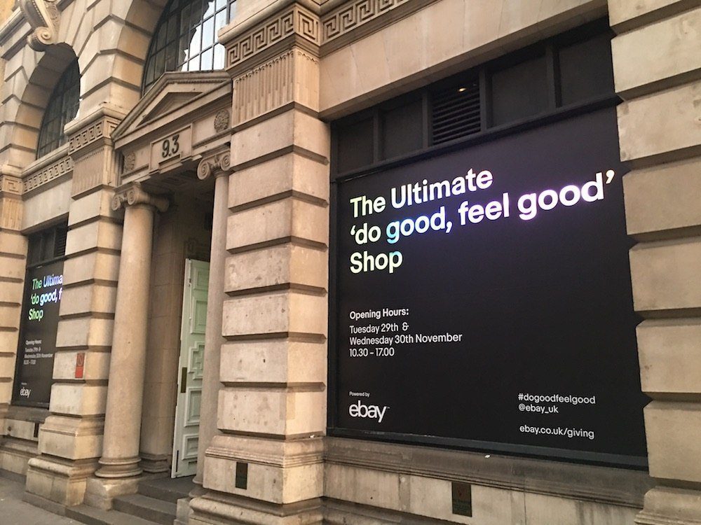
If you’re an etailer, bringing your brand into the “real world” is often of strategic importance. Ebay — an eCommerce company that has enjoyed many ups and downs over the years — brought a pop-up store to London just this week in order to “make shopping a less stressful experience” and to highlight the #GivingTuesday theme.
- The need: make it easier to know what you want and to retain the pleasure of shopping/giving
- The answer: a proposition of the best gifts according to your emotional reaction via facial expression
To quote the Daily Mail, this was supposed to the “first emotionally-powered shop in London.” This pop up store was located at 93 Mortimer Street, right off Regent Street. [It was open on Oct 29-30 from 9am to 5pm.] I’d note that this is far from Ebay’s first attempt at a pop-up store. They’ve been doing these experiments since at least 2011 in London.
The Stress-Relief Experience
In a small hall with high ceilings, there were 2 screens, 4 booths and one hot drink station. When I arrived, a little after 3pm on the second of the two days that the store was open, I was the sole “shopper” and was eagerly greeted by the milling staff (read: event agency). The first port of call was to understand the offering. Where Ebay made it “simple” was that there were just 12 products on “offer” with each being from a major name brand and each brand had an associated charitable initiative.
In the booth, the screen provides a scroll through of the twelve items (Dyson hand vaccuum cleaner, Canon camera, MINI bicycle…) with a description and pricing plus a short write-up about the linked charity. Below the screen, looking up at your face, there was a camera, co-created with a Silicon Valley start-up, Lightwave, that uses facial decoding to detect the user’s reaction to each product. Guided by a gentle English female voice, you pass through each product and based on your facial smirks, smiles and otherwise subtle indications, sends you a report indicating the best mix. Thus, I sat through and pondered the gifts that would be suit for my daughter, son and wife.
For better effect, I did the experience twice and made sure that the second time I wildly exaggerated my facial reactions and explicitly considered different products. In the second session, I thought only of the products that I might want in priority.
Here are the results as emailed to me. The first one was what the machine said I should buy stress freely for my family:
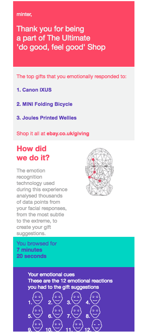
The proposal according to my facial reactions: for my family
The second result was after my hugely exaggerated facial expressions for the gifts I’d want for me. I spent considerably less time looking and was more focused on making strong singular expressions!
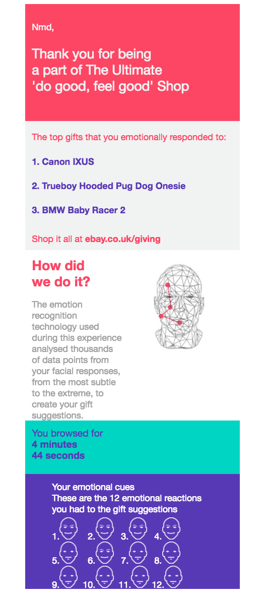
The proposal according to my exaggerated facial reactions: for me
The Do Good, Feel Good Experience – My Conclusions:
- As far as the experience goes, it was agreeable and the staff were pleasant. The fact that there was no one else to fight through was decidedly relaxing, although probably not as much the objective for the Ebay team.
- The products chosen were too limited to really capture my fancy or even find anything for the family.
- The end results make a complete mockery of the facial recognition algorithm — these results were the furthest from my thoughts in both cases.
- The user experience (UX) of the screen itself was very average. Things to improve: seat height so that all parts of the screen are easy to reach. Moreover, the placement and size of the screen made it hard to keep all the information together.
- I am sure that they could have included some kind of social element (i.e. “share this”) after completion. Even the bland email I was sent afterwards doesn’t facilitate this.
Bottom line: yeah, the idea of artificial intelligence and facial recognition to make a stress-free shopping experience is desirable. But the execution this time around is lightyears away from an appropriate solution. Better luck next time.